Tokenomics
I built an ambient gauge so developers stop leaving the terminal to check usage. It tells you, at a glance, whether you have room for one more run.
~14
Providers
2
Surfaces, one design system
1 month
To first ship
Free
Forever
AI developers need to know if they have headroom for a long session. The data existed — it was just in the wrong place. The only signal was an error in the terminal, mid-session, after you'd already hit the wall.
My Role
Solo designer and director. Product vision, UX, information design, content architecture, AI-assisted implementation, and distribution — directing an 11-agent AI team across design, engineering, and release.
The Spark
I didn't want an alert. I wanted to know if I had room.
I build with Claude Code every day, and I kept hitting my token limit mid-session with no warning. The only signal was an error in the terminal — and by then I'd already hit the wall. A feedback loop that only fires after you've failed isn't a feedback loop. It's a postmortem.
I didn't want a reactive alert. An alert interrupts; it arrives too late and asks for attention I don't have mid-thought. I wanted ambient awareness — something glanceable, with zero interaction, that lived at the edge of my vision while I worked.
I didn't want to see a number. I wanted to know if I had room for one more run.
The First Version
The menu bar was the only honest surface
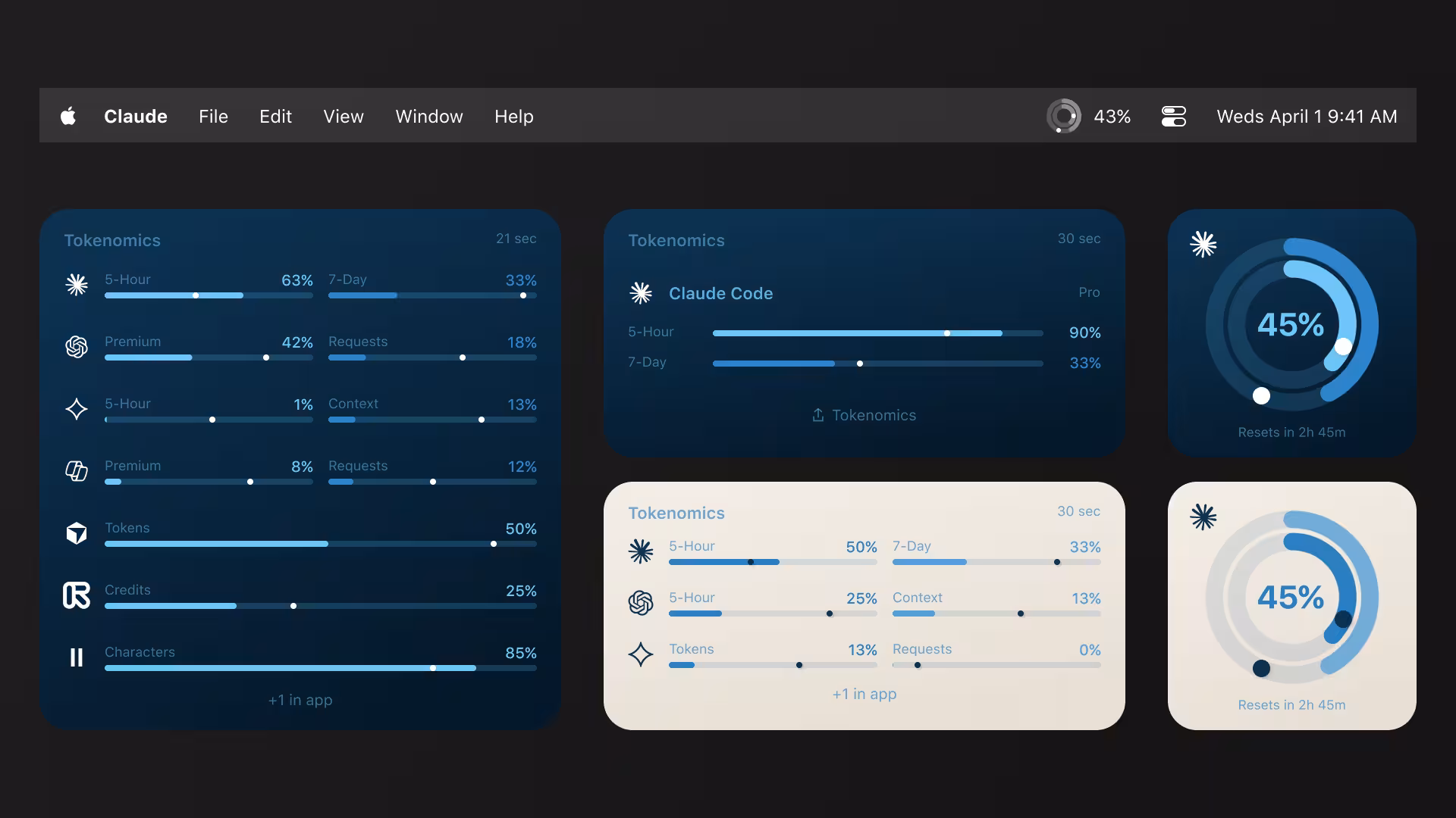
The first version rendered two concentric rings in the system menu bar. Inner ring is the 5-hour window; outer ring is the 7-day window. Both readable without a click.
The menu bar was the only right surface, and the choice was deliberate. A notification interrupts. A window forces a context switch. A Dock badge is too easy to ignore. The menu bar is always visible, costs zero interaction to read, and lives exactly where your peripheral vision already roams while you code. I leaned on Apple's Activity Rings because the metaphor is culturally pre-loaded — full means done, and no legend is required. I shipped it single-provider, Claude only, on purpose.
Close-up of the macOS menu bar in light mode showing the Tokenomics two-ring glyph — inner ring (5-hour window) and outer ring (7-day window) — at small system size, sitting among other menu-bar icons. The rings read clearly even at ~18pt.
Light mode.
The same menu-bar two-ring glyph in macOS dark mode, showing the rings holding contrast against a dark bar. Identical composition to the light version for direct comparison.
Dark mode.
The rings live in the menu bar, not a window. Always visible, zero interaction to read — designed for the edge of your attention, not the center of it.
Data → signal
Raw data
where you are
Actionable signal
ahead of pace, or room to spare
Same fill. The pace dot is the difference between a number and a decision.
Data → signal
Where you are versus whether you're okay
A ring at fifty percent is raw data. It tells you where you are. The pace dot marks where the fill should be right now if you were spending evenly across the window. The gap between the dot and the arc is the whole product.
That gap turns utilization into a decision: am I burning ahead of pace, or do I have headroom for a long run? It's an original information-design element, not a stock control I pulled off a shelf. A developer would have shown you the number. This shows you what the number means.
It only worked for me
An abstraction that holds for three is a principle
Friends said: cool, but does it work with my tools? Adding a second and third provider sounded like a feature. It was actually an architecture test — because the providers don't agree on anything. Codex exposes a context window, not a rate limit; its rate field is always 0.0, a CLI bug, so I show the context-window fill that matches what the CLI itself prints. Gemini exposes request counts with no reset timer. Three structurally different data models, one visual language. Does the design hold?
It did, behind a provider protocol with a small escape hatch — and the view layer never got rewritten. An abstraction that holds for one input is a coincidence; one that holds for three is a design principle. Then I added Copilot and Cursor, but instead of asking for a new login I leaned on auth the user already had: Copilot through the existing gh CLI token, Cursor through its own local state. Five providers, install-and-forget.
Content architecture
With three providers, the outer ring meant a 7-day window for one tool, a context window for another, a daily cap for a third. Provider-specific labels broke. The fix was behavioral language — 'nearest limit' and 'broader context' — true no matter the provider. That's content architecture, not copywriting.
5 →
Providers, one view layer
3
Data models, one metaphor
0
View-layer rewrites
A second surface
The number you need is worst-of-N
Ambient awareness shouldn't stop when you leave the editor. So I extended the idea to the desktop people stare at between sessions: widgets. The one number a multi-tool developer actually needs is worst-of-N — the single provider closest to its limit, surfaced without having to check each one.
WidgetKit is a hard-constraint surface: no scrolling, fixed sizes, taps only through URL schemes. The layout had to hold from one provider up to eight or more without breaking rhythm. Constraints like these are design inputs, not obstacles — they force the hierarchy to be honest.
A macOS desktop showing small, medium, and large Tokenomics widgets arranged together. The small widget shows a single worst-of-N ring with its provider name. The medium and large widgets stack a worst-of-N hero ring beside a tidy list of provider rows, each with its own mini ring and percentage. Layout stays balanced from one provider to many.
Three widget sizes, one rule: surface the provider closest to its limit. The layout holds from a single tool to eight-plus without a redesign.
The 8th-grader test
The user it was built for couldn't finish setup
There was a contradiction buried in the product. The value prop was ambient visibility for anyone who uses AI tools — but setup required installing Node.js in Terminal. The person it was built for wasn't the person who could finish setting it up.
So I set a sharper constraint and designed to it. To honor it, Tokenomics now ships its own Node runtime — the way Electron ships Chromium — and runs CLI installs as a hidden subprocess. No Terminal, ever. Each provider is labeled Quick (sign in once) or Guided (we walk you through). I also deleted an earlier 'For developers' tier, because that label quietly tells some users they're not smart enough for part of the product. That's a positioning decision hiding inside a single word.
The constraint: an 8th-grader should be able to connect any provider.
Opening it to everyone
The people flying blind had no API at all
Then the realization that reframed the whole product: the users who'd benefit most from watching their limits — free- and consumer-tier users — had zero visibility, because consumer plans expose no public API. They were the ones flying blind, and they were the ones I couldn't reach.
But a signed-in browser session already holds every credential needed, and a browser extension is the only legitimate bridge to it. So I built the web companion — an extension that reads the user's own authenticated sessions through real endpoints and passive observation, no scraping. It unlocks browser-only tools the Mac app can't reach, including creative AI: Midjourney (the first usage tracker shipped for it anywhere), plus Suno and Udio. The product now spans roughly fourteen providers across two surfaces.
The macOS menu-bar popover: tabbed provider header, two concentric rings with the pace marker on the inner ring, a plan badge, and a 'stays on your machine' privacy line at the bottom.
Mac popover.
The browser-extension popup rendered as a pixel-identical port of the Mac popover — same rings, same pace marker, same plan badge, same privacy line. Placed side by side, the two are indistinguishable except for the chrome around them.
Extension popup.
The extension popup is a 1:1 port of the Mac popover — same rings, same pace marker, same plan badge, same data contract, same privacy posture. One design system, two platforms.
~14
Providers
2
Surfaces, one design system
1
Data contract
The color system
The two surfaces look identical because they share one set of tokens. The whole palette comes from two ideas — Activity-Ring blue and warm cream — scaled into ink, brand, and surface ramps that drive every ring, bar, badge, and background across the app, the widgets, and the extension.
Ink
Brand blue
Cream
One token set drives light and dark, the menu bar and the browser — documented end to end in the brand guidelines.
Going back to fix it
Add a surface and the ripples reach the front door
The onboarding I'd just shipped and called done wasn't done. The extension changed the connection model: a provider could now be reached two ways — through the Mac app or through the browser. First-run suddenly had to teach a paired install (connect the extension, link it to the app) and show which path each provider uses, with a small source icon — a globe for web, a terminal for CLI, a key for API.
I reopened a flow I'd only just stabilized and reworked the model, rather than bolting the extension on as a side door. Bolting it on would have been faster and would have read as a seam forever.
A first-run experience is never 'done.' Add a surface and the ripples reach the front door. The mature move is to redesign the model, not patch around it.
Behind the build
An 11-agent team. One director.
I didn't hand-write most of this code. I directed a team of specialized AI agents — a product manager to sequence the work; UX, UI, and senior design agents for the craft; a copywriter for the microcopy (“nearest limit,” “Updated 2m ago”); a SwiftUI developer to implement; and a senior reviewer to check the build against the spec. I made every design call; the agents executed. One night, two developer agents built the first usage tracker anyone has shipped for Midjourney — in parallel, while I slept — and left me a prioritized test list for the morning. The job isn't writing the code anymore. It's knowing what's right, and directing until it is.


The AI filled the grid and left dead space at the bottom. Empty space is a product decision, not a layout accident — I added a quiet Share affordance to earn it back, then polished the geometry in Figma. Drag to compare.
Shipping is a design decision
Most side projects die before a stranger can install them
Most side projects die in the gap between 'works on my machine' and 'a stranger can install it.' I treated that gap as part of the design. Two channels, two trust signals: a direct download for discoverability, and a Homebrew cask — brew install rob-stout/tap/tokenomics — for the moment a developer actually decides to commit.
The cask build is code-signed, notarized, and auto-updating, because the install is the first interaction and it sets the tone for everything after. Choosing to solve distribution is a product-strategy decision, not an engineering chore — and deciding which channel meets the user at which moment is squarely a design call.
What Shipped
~14
Providers
2
Surfaces
0
View-layer rewrites
v2.9
Current version
Tokenomics ships through Homebrew and direct download — code-signed, notarized, and auto-updating. It now spans roughly fourteen providers across two surfaces that share one design system and one data contract. It's free, and the view layer was never rewritten as providers were added.
- Roughly fourteen providers across two surfaces — one design system, one data contract
- Zero view-layer rewrites as providers were added, from one to fourteen
- First usage tracker shipped for Midjourney anywhere
- Ships via Homebrew cask and direct download — signed, notarized, auto-updating
- Free forever — built so an 8th-grader can connect any provider without a terminal
What I Learned
The most undervalued problem in information design is the gap between data and signal. A ring at fifty percent is a number with a shape; the pace dot turns it into a judgment — you're ahead, or you have room. That distance is where most dashboards fail. The second lesson surfaced only at scale: when one ring meant a 7-day window for one tool, a context window for another, and a daily cap for a third, provider-specific labels broke. The fix was behavioral language — 'nearest limit,' 'broader context' — true no matter the provider. That's content architecture, not copywriting. And the third: a first-run experience is never done. Add a surface and the ripples reach the front door. The mature move is to redesign the model, not patch around it.
What this demonstrates