Cortex · Brand Guide · v3

The memory
Claude forgot.

Everything you need to speak, write, and build like Cortex — the complete system in one place. Part I is the brand foundation: essence, wordmark, typography, color, the wave motif, voice, and messaging, derived from the production landing page at remembercortex.com. Part II is the app implementation layer: dark palette, semantic color roles, components, menu bar icon, motion, and the reskin map the developer codifies in DesignTokens.swift. Alternatives considered but not selected are archived in decision-history.html.

Part I

Brand foundations

The brand DNA — what Cortex sounds like, looks like, and stands for. Every app decision in Part II serves these.

Brand essence

The one-line fingerprints. Every other decision in this guide serves these.

Headline
The memory Claude forgot.
The product's reason for being in five words. Lowercase "memory" — it's a feeling, not a feature.
Tagline
Like having a team who actually read your notes before the meeting.
The warm, human metaphor. Use beneath the headline or in social posts where the headline alone feels cold.
Promise
Every conversation, Claude starts over. Cortex gives it somewhere to remember.
The problem and the fix in one breath. The core subhead across hero, OG, and press copy.
Trust line
Free · No account needed · Your data stays on your Mac
Three dots, three promises. Use beneath any primary CTA. Never shorten.
Positioning
A quiet, neuroscience-grounded memory layer for Claude — on your Mac.
What Cortex is, in the vocabulary of the category. Six layers. Local-first. Human metaphor.
Personality
Calm. Confident. Quietly clever.
A well-read colleague who files things so you don't have to. Never loud. Never salesy.

Wordmark & favicon

Cortex doesn't use a pictorial logo. The wordmark — the word "Cortex" set in Hedvig Letters Serif 400 — is the identity. The favicon translates the wave stack into a tiny graphic signal.

Cortex
Primary · Charcoal on Linen
Cortex.
With teal terminal dot · optional
Cortex
Reversed · Linen on Ink

Favicon & app icons

The favicon stacks five wave bands inside a linen tile — a micro expression of the memory system. The app icon uses the same language at larger sizes.

Favicon · 325 bands · linen tile
App icon · 64Scales cleanly · no shadow
PWA · 96+Same artwork, any size

Typography

Two families do the work. Hedvig Letters Serif is a single-weight (400) serif with a warm, editorial character — every headline on the site is set in it. DM Sans is the reader's font, humanist and kind to the eye.

Heading Hedvig Letters Serif Single weight (400) Google Fonts · free
Remember everything.
ABCDEFGHIJKLMNOPQRSTUVWXYZ  abcdefghijklmnopqrstuvwxyz  0123456789  & ? ! —
Body DM Sans wght 400, 500, 600, 700 · italic 400 Google Fonts · free

Cortex runs quietly on your Mac. It captures your corrections, your preferences, and your project rules — and surfaces them to Claude the moment they're relevant.

ABCDEFGHIJKLMNOPQRSTUVWXYZ  abcdefghijklmnopqrstuvwxyz  0123456789  & ? ! —

Type hierarchy

Hierarchy lives in the sizes below. All heading sizes use Hedvig at weight 400 — no bolder variant exists. Differentiation comes from size, tracking, and color. Values exactly mirror the production landing page.

Display · Hero Hedvig 400 clamp(34px, 4.8vw, 72px) tracking −0.03em Used on: hero h1
The Memory Claude Forgot
Display · Section Hedvig 400 clamp(30px, 4vw, 48px) tracking −0.015em Used on: all centered section h2
Not all memory is the same.
Display · Retrieval Hedvig 400 clamp(28px, 3.8vw, 46px) tracking −0.015em Used on: left-aligned retrieval heading
Cortex knows what's relevant before Claude asks.
Display · Card Hedvig 400 24px Used on: audience cards, popover audience header
Helpful for a marketer
Display · Label Hedvig 400 18px Used on: memory-row labels
Sensory memory
Body · Eyebrow DM Sans 600 12px tracking 1.5px · UPPERCASE Used on: section eyebrows
Six Layers of Memory
Body · Subhead DM Sans 400 clamp(16px, 2vw, 19px) Used on: hero subhead, section intros
Every conversation, Claude starts over. Cortex gives it somewhere to remember. It runs quietly on your Mac and hands Claude the right context at the right moment.
Body · Italic DM Sans 400 italic 17–18px Used on: hero tagline, analogies, pull quotes
"Like having a team who actually read your notes before the meeting."
Body · Base DM Sans 400 16–17px Used on: default body copy
What's happening right now. Current session, current file, current thought. The raw stream of this session — files touched, commands run, messages exchanged.
Body · Small DM Sans 400 14px Used on: trust line, captions, fine print
Free · No account needed · Your data stays on your Mac

Hierarchy at a glance

Every level stacked. Pick one based on its role in the layout.

Hero
Remember.
Section
How it works.
Retrieval
Cortex knows what's relevant.
Card
Helpful for a marketer
Label
Sensory memory
Eyebrow
Six layers of memory
Subhead
Every conversation, Claude starts over. Cortex gives it somewhere to remember.
Italic
Like a team who actually read your notes.
Body
The raw stream of this session. Files touched, commands run, messages exchanged.
Small
Free · No account needed · Your data stays on your Mac

Pairing in action

How Hedvig and DM Sans work together — eyebrow, display, italic tagline, and body in one lockup.

Now in beta · for macOS

The memory Claude forgot.

Like a team who actually read your notes before the meeting.

Cortex runs quietly on your Mac. It captures your corrections, your preferences, and your project rules — and hands them back to Claude the moment they're relevant. Free to download. No account needed. Your data stays on your Mac.

Color system

Six wave colors map to six layers of memory — ephemeral to permanent. Each ships with a 62% alpha tint for backgrounds. Charcoal and gray are the "human element" neutrals.

α 100
α 62
Cyan
#83DFEF · #B6ECF5
Sensory memory
α 100
α 62
Teal
#5593A3 · #9BBDC5
Working memory
α 100
α 62
Periwinkle
#90ACC8 · #BECEDD
Episodic memory
α 100
α 62
Mauve
#BB97BC · #D6C3D7
Semantic memory
α 100
α 62
Rose
#DC92A4 · #EBBEC8
Procedural memory
α 100
α 62
Peach
#E8AB9B · #F1CBC1
Long-term memory
α 100
α 62
Charcoal
#4C4C4C · #AAAAAA
The human element

Neutrals & surfaces

Linen is the default page surface. Linen-dark signals a secondary block. White is reserved for elevated cards. Ink is reserved for inverted moments and tags.

Linen
#FAF8F5
Linen dark
#F2EEE6
Pure white
#FFFFFF
Ink
#2C2825
Ink muted
#6B6460

The wave motif

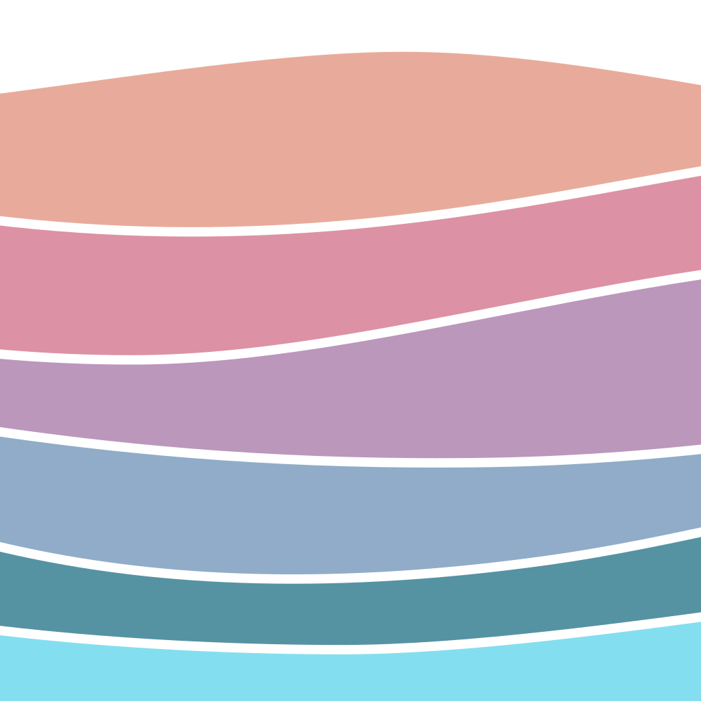
The hero's stacked waves are the closest thing Cortex has to a pictorial mark. Six bands, top to bottom: the ephemeral surface (cyan) layered down to permanent long-term memory (peach). When in doubt, waves carry the brand — use them full-bleed, unframed, at the foot of a section.

SensoryCyan · top band
WorkingTeal
EpisodicPeriwinkle
SemanticMauve
ProceduralRose
Long-termPeach · foundation
band-order: cyan → teal → periwinkle → mauve → rose → peach
stroke: linen (#FAF8F5), 4px, between every band
direction: always layered top-ephemeral to bottom-permanent
amplitude: 2-hump bands taller, 3-hump bands shorter — avoid flat horizons
micro use: the favicon is the wave stack reduced to 5 pill-bars

Voice & tone

Cortex sounds like a calm, well-read colleague explaining something important without raising its voice. Not cute. Not clever for the sake of clever. Just true.

Quiet confidence

State the fact and move on. No superlatives, no hype. "Cortex runs quietly on your Mac." — not "the most powerful memory system ever built for AI."

Human metaphors

Ground every abstract idea in something physical. Teams reading notes. Groundhog day. Muscle memory. Files on a desk. The metaphor does the heavy lifting.

Short sentences with rhythm

Short. Then a longer one that earns the short one. Then short again. Our copy often breaks into three beats — problem, turn, promise.

Neuroscience-grounded, plainly said

Say "sensory memory," "episodic memory," "long-term memory." Never hide behind them. Always follow with a plain-English sentence anyone can picture.

Privacy as a principle, not a pitch

State what we don't do as flatly as what we do. "Your data stays on your Mac." Don't dramatize privacy — trust comes from understatement.

The em-dash is the brand's punctuation

We use em-dashes where most brands use colons. They invite the turn inside a sentence — exactly the move our copy loves.

Do say / Don't say

Cortex voice Not Cortex
The memory Claude forgot.
The revolutionary AI memory platform.
It runs quietly on your Mac.
Unleash the full power of local AI.
Correct Claude once. Cortex catches it.
Leverage corrections for future prompt engineering workflows.
Your data stays on your Mac.
Bank-grade encryption keeps your data safe in the cloud.
Not all memory is the same.
Introducing our proprietary six-tier memory architecture.
Cortex stops the groundhog day.
Cortex streamlines AI productivity loops.

Messaging library

Ready-to-use lines pulled from the site. Reach for these before writing new copy — they've already been tuned.

Hero H1
The Memory Claude Forgot.
Hero italic tagline
Like having a team who actually read your notes before the meeting.
Hero subhead
Every conversation, Claude starts over. Cortex gives it somewhere to remember. It runs quietly on your Mac, captures your corrections and preferences, and hands them back to Claude the moment they're relevant.
Trust line
Free · No account needed · Your data stays on your Mac
Section · The Gap
Claude has a memory now. Sort of.
Section · Memory types
Not all memory is the same.
Section · Retrieval
Cortex knows what's relevant before Claude asks.
Three-step promise
Capture. Correct Claude once. Organize. It files the memory. Surface. Next session, Claude already knows.
Closer
"The first session is the hardest one you'll have. After that, Claude has muscle memory."
Primary CTA
Join the Waitlist
Secondary CTA
Add to Claude Code
Pricing tier label
Simple Pricing. Honest Tiers.

Buttons

Two variants, both built on a shared .btn-pill base. Every button reserves a 2px transparent border so primary and outline render identical heights. Hover drops opacity to 0.88 and lifts the button 1px. Disabled disables pointer events and fades to 0.45 opacity.

Small
Primary · smDownload
Outline · smLearn more
Live
padding: 9px 20px (base), 8px 18px (sm)
border-radius: 100px (pill)
border: 2px solid (transparent on primary, teal on outline)
font: DM Sans 600, 14px / 13px (sm), line-height 1.2
hover: opacity 0.88, translateY(-1px), 150ms
focus-visible: 2px teal outline, 3px offset
disabled: opacity 0.45, pointer-events none

Surfaces & spacing

Cortex lives on linen. Cards float on white. Ink is reserved. Rhythm is generous — the site uses 96px section padding on desktop so every message has room to land.

Linen · Default page
Every section sits on linen.
background: #FAF8F5
Linen dark · Secondary block
A second, quieter surface.
background: #F2EEE6
White · Elevated card
Cards, mocks, and pricing.
background: #FFFFFF · border: rgba(44,40,37,0.10)
Ink · Inverted moment
Tags, reserved for emphasis.
background: #2C2825

Spacing scale

Token
Value
Used for
space-1
8 px
Icon gaps, inline meta
space-2
16 px
Button padding, row gaps, small margins
space-3
24 px
Container side-padding, card padding
space-4
32 px
Between related elements in a block
space-5
48 px
Between a section intro and its content
space-6
64 px
Section padding on mobile
space-7
96 px
Section padding on desktop — the brand's default rhythm
container: max-width 1120–1160px, 24–32px side padding
narrow: max-width 680px, centered — for prose-heavy sections
card-radius: 14–20px
hairline-rule: 1px solid rgba(44,40,37,0.10)
dashed-rule: 1px dashed rgba(44,40,37,0.10) — reserved for in-card separators

Do & don't

Shorthand for staying on-brand when nothing else in this guide has answered the question.

Do

  • Let Hedvig carry the headline. Weight 400, always.
  • Map every memory-layer color to its semantic meaning (cyan = sensory, etc.).
  • Use the wave stack when you need a brand signal — it's the mark.
  • Favor em-dashes and short sentences with a turn.
  • Ground abstract ideas in a human metaphor.
  • State privacy as a fact, not a feature.
  • Keep 96px section padding on desktop — room is part of the voice.

Don't

  • Use bold or italic Hedvig. There is no bold. There is no italic.
  • Swap memory-color mappings for decoration. Cyan is never semantic memory.
  • Place the wordmark on an accent color. Charcoal on linen, or linen on ink.
  • Hype. No "revolutionary," no "unleash," no "game-changer."
  • Stack more than two waves when shrinking the motif — it gets muddy.
  • Use gradients across brand colors. They're bands, not a ramp.
  • Replace the trust line with a shorter one. Three dots, always.
Part II

The app inside the memory

The implementation layer — where the brand foundation becomes a working macOS app. Dark palette, semantic color roles, density, components, motion, and the menu bar icon. The single source of truth for DesignTokens.swift, font bundling, and the reskin map.

Decisions locked as of 2026-04-22 — expanded Tier 4 tags
  • 1.Dark palette — warm-tinted near-blacks #1A1816 / #242120 / #2E2C2A (dark.base / dark.elevated / dark.secondary). See §1.
  • 2.Gray on linen#958D88 at AA-Large only (3.15:1). Accepted; color is always redundant with position/icon in every usage. See §2 and §9.
  • 3.Success green#358267 light / #57B58F dark. Mossier than standard Material green; stays within the warm brand spectrum. See §2.
  • 4.TypographyDM Sans everywhere in-app (400/500/600/700/italic 400). Hedvig Letters Serif is display-only: 15pt panel title (menuTitle) and 28pt onboarding hero. SF System is not part of the app typeface system. See §4 and §4b.
  • 5.Menu bar icon — Rob's custom 6-band stepped-opacity wave. Three states: Idle (static artwork), Active (opacity pulse 1.0 → 0.55 → 1.0 on idle artwork, fires only during memory writes), Attention (custom alert artwork with warning triangle). All assets in brand/Logos and Icons/. See §7.
  • 6.Density ramp, motion tokens, semantic color roles — all locked. See §2, §3, §8.

Dark mode palette

The marketing palette was calibrated for linen — those saturation levels vibrate against dark surfaces. Each memory color is desaturated ~20% and value-lifted ~10% so it reads as the same hue without visual tension. Dark surfaces use warm-tinted near-blacks (#1A1816 / #242120 / #2E2C2A) that stay in the linen-to-ink family rather than neutral gray, grounding dark mode in the same warmth as the brand. Depth follows macOS elevation logic: deepest background at the back, lighter surfaces forward.

Memory colors — light / dark pairs

Light #83DFEF
Dark #5BBFCC
Cyan Sensory memory
Light #5593A3
Dark #4A8293
Teal Working memory
Light #90ACC8
Dark #7A96B2
Periwinkle Episodic memory
Light #BB97BC
Dark #9E82A0
Mauve Semantic memory
Light #DC92A4
Dark #C07D90
Rose Procedural memory
Light #E8AB9B
Dark #C8907F
Peach Long-term memory

Dark surfaces — elevation hierarchy

In dark mode, depth is expressed by lightening surfaces forward — the inverse of light-mode shadows. The popover sits on dark.base; rows hover to dark.elevated.

dark.base
#1A1816
Canvas / popover bg
dark.elevated
#242120
Row hover / cards
dark.secondary
#2E2C2A
Panel headers / chips

Dark text ramp

Primary text — #EDE9E3 text.primary · 4.9:1 vs dark.base
Secondary text — #9D9690 text.secondary · metadata, detail
Tertiary text — #6B6560 text.tertiary · timestamps, captions
Quaternary text — #4A4744 text.quaternary · disabled / placeholder

Semantic role table

This is the contract between the brand and the SwiftUI layer. Every Color.accentColor and hardcoded hex in the app maps to one of these roles. Start here when writing the color extension.

Role token
Light
Dark
Usage note
Interactive & accent
accent
#5593A3
#4A8293
Primary interactive color — teal. Buttons, links, focus rings, active states.
accent.muted
#9BBDC5
teal 25% alpha
Chip backgrounds, hover fills, selected row tints. Never used for text.
Surfaces
surface.primary
#FAF8F5
#1A1816
Popover canvas, main window background. The linen → near-black swap.
surface.secondary
#F2EEE6
#2E2C2A
Section headers, chip resting state, panel footer bg.
surface.elevated
#FFFFFF
#242120
Hovered rows, modal cards, inspector panels. One step above primary.
Text
text.primary
#4C4C4C
#EDE9E3
Row titles, panel headers, all primary labels. Maps to .primary label.
text.secondary
#6B6460
#9D9690
Row detail lines, descriptions. Maps to .secondary label.
text.tertiary
#958D88
#6B6560
Timestamps, metadata, captions at 11pt. AA-Large only (3.15:1 on linen) — accepted because color is redundant with position/icon in every usage.
text.quaternary
#CCCCCC
#4A4744
Placeholder text, disabled labels. Maps to .quaternary label.
Structure
divider
ink 10% alpha
white 8% alpha
Section dividers between logical groups. 1pt line.
separator
ink 6% alpha
white 5% alpha
Between rows in a list. Lighter than divider — don't use both.
Status
success
#358267
#57B58F
MCP connected state, sync confirmed. Status dot + banner bg at 15% alpha.
warning
#B07D2A
#C99040
StorageWarningBanner, quota approaching. Warm amber — adjacent to brand peach.
error
#B6556A
#D4708A
MCP disconnected, destructive actions, error banners. Echoes rose hue family.
Memory type dots
memory.sensory
#83DFEF
#5BBFCC
Cyan dot on sensory memory rows. 7pt circle.
memory.working
#5593A3
#4A8293
Teal dot. Also the accent color — working memory is the "live" layer.
memory.episodic
#90ACC8
#7A96B2
Periwinkle dot. Session-level memories.
memory.semantic
#BB97BC
#9E82A0
Mauve dot. Conceptual knowledge, standing instructions.
memory.procedural
#DC92A4
#C07D90
Rose dot. Corrections, how-to rules, behavioral patterns.
memory.longTerm
#E8AB9B
#C8907F
Peach dot. Consolidated, high-confidence memories.

Density ramp

Extends Spacing.xs/sm/md/lg/xl (4/8/12/16/20pt) already in CortexPopoverView.swift. The existing five tokens cover component internals. The new tokens cover layout-level spacing. The "tight" column applies to the 360pt popover; "window" to the 900pt main view.

Token
Value
Scale
Popover tight
Main window
Existing — component internals (do not change)
.xs 4pt
Icon-to-label gap Icon-to-label gap
.sm 8pt
Chip inner H padding Chip inner H padding
.md 12pt
Row V padding Card inner padding
.lg 16pt
Row H padding Row H padding
.xl 20pt
Section header V Between groups
New — layout level
.2xl 24pt
Panel header H inset Inspector side padding
.3xl 32pt
Sidebar section gap
.4xl 48pt
Onboarding section gap
.5xl 64pt
Onboarding hero top

The popover is intentionally dense — 360pt wide, content-heavy, glance-use. The main window affords more breathing room. Never use .3xl or larger inside the popover.

App typography

Eight named styles cover every text moment in the app. Hedvig is approved in the app, but restricted to display moments only — the 15pt panel title and 28pt onboarding hero. At 11–13pt in rows, its serifs render soft on macOS text layout; at 15pt+ it’s the hero of the brand. Everywhere else is DM Sans — SF System is no longer part of the app’s typeface system.

menuTitle Hedvig 400 · 15pt
tracking −0.01em
light: text.primary
dark: text.primary
Cortex.
sectionHeader DM Sans 700 · 10pt
tracking 1.4px · ALL CAPS
light: text.tertiary
dark: text.tertiary
Working Memory — 4 items
rowTitle DM Sans 500 · 13pt
tracking 0
light: text.primary
dark: text.primary
Always use guard let, not if let
rowDetail DM Sans 400 · 12pt
tracking 0
light: text.secondary
dark: text.secondary
Procedural rule — added 3 days ago
metadata DM Sans 400 · 11pt
tracking +0.01em
light: text.tertiary
dark: text.tertiary
caption DM Sans 400 · 10pt
tracking +0.02em
light: text.quaternary
dark: text.quaternary
Last synced 14 minutes ago
chipLabel DM Sans 600 · 11pt
tracking +0.04em
light: text.primary
dark: text.primary
All Working
onboardingHero Hedvig 400 · 28pt
tracking −0.02em · lh 1.15
light: text.primary
dark: text.primary
The memory
Claude forgot.
onboardingBody DM Sans 400 · 15pt
tracking 0 · lh 1.6
light: text.secondary
dark: text.secondary
Cortex watches your sessions and surfaces what Claude needs — before it asks.

Tags — informative, non-interactive

Tier 4

Tags label; they don't act. No hover state, no pointer cursor, no click target. If it triggers something, it's a chip, not a tag.

PropertyValueTokenNote
shape pill 999px border-radius: 999px
font DM Sans 400 10pt Smaller than chip (11pt) — unambiguous hierarchy
padding 2px 8px Tight — tags live inside rows, not as standalone controls
fill 8% tint concept color at 8% opacity over surface
text concept color Darkened to a readable variant on light surfaces where full-strength fails AA at 10pt. See specimens below.
border none No border in light mode. Dark mode: optional 15% opacity border if fill reads too soft.
interaction none No hover state. No focus ring. No active state. Cursor: default (not pointer).

Memory-layer tags — light surface specimens

Sensory
fill: #83DFEF @ 8% text: #2B7C8A (readable)
Cyan at full strength (#83DFEF) on linen 8% ≈ 1.4:1 — far below AA. Text darkened to #2B7C8A for 4.6:1 AA pass at 10pt.
Working
fill: #5593A3 @ 8% text: #3A7385 (readable)
Teal at full strength (#5593A3) ≈ 3.5:1 — fails AA at 10pt. Darkened to #3A7385 for 4.7:1 pass.
Episodic
fill: #90ACC8 @ 8% text: #4F6F8A (readable)
Periwinkle at full strength (#90ACC8) ≈ 2.3:1 — fails AA. Darkened to #4F6F8A for 4.6:1 pass.
Semantic
fill: #BB97BC @ 8% text: #7A5A7C (readable)
Mauve at full strength (#BB97BC) ≈ 2.2:1 — fails AA. Darkened to #7A5A7C for 4.8:1 pass.
Procedural
fill: #DC92A4 @ 8% text: #9B4E63 (readable)
Rose at full strength (#DC92A4) ≈ 2.0:1 — fails AA. Darkened to #9B4E63 for 4.6:1 pass.
Long-term
fill: #E8AB9B @ 8% text: #8F5040 (readable)
Peach at full strength (#E8AB9B) ≈ 1.9:1 — fails AA. Darkened to #8F5040 for 4.9:1 pass.

System tags — light surface

NEW
fill: teal @ 8% text: #3A7385 · tracking 1px
Uppercase + 1px tracking. Used for first-appearance flags on features.
BETA
fill: teal @ 8% text: #3A7385 · tracking 1px
Same treatment as NEW — same status register, same visual weight.
0.91 conf.
fill: #958D88 @ 12% text: charcoal #4C4C4C
Confidence is informational, not memory-layer branded. Neutral gray fill, charcoal text. 12% fill (slightly heavier than 8%) to prevent it from disappearing next to branded tags.

Memory-layer tags — dark surface

Sensory text: #7DD4E0 Dark-cyan lightened — approx 5.2:1 on #1A1816
Working text: #7BAFC0 Dark-teal lightened — approx 4.8:1 on #1A1816
Episodic text: #9DB4C8 Dark-periwinkle lightened — approx 4.6:1 on #1A1816
Semantic text: #C4A6C6 Dark-mauve lightened — approx 5.0:1 on #1A1816
Procedural text: #D9A0B0 Dark-rose lightened — approx 4.7:1 on #1A1816
Long-term text: #DEB09F Dark-peach lightened — approx 4.8:1 on #1A1816
Do
  • Memory-type labels inside row detail lines
  • Confidence scores and status markers
  • Inline metadata (NEW, BETA) inside content rows
Don't
  • Use for anything the user can click (use a chip)
  • Use at sizes larger than 10pt
  • Use as standalone controls outside of row/inline contexts

Why not Hedvig throughout? — Hedvig is a display serif optimized for 24pt+. At 10–13pt, its thin strokes disappear on non-retina displays and its x-height creates uneven optical alignment in tight list rows. The DM Sans vs. SF comparison and the decision rationale are documented in §4b.

Typography — DM Sans, locked

Decision made

DM Sans everywhere. SF System is not part of the app typeface system. DM Sans carries brand identity from web into app; held up at 11pt on Retina after A/B review. Alternatives archived in decision-history.html.

Menu bar popover mockup

360pt wide — the exact popover width in production. The popover has two view states toggled by the segmented pill in the header. Both states are rendered in full below (light + dark) so every element is specced in context. All elements use semantic role tokens from §2.

State A — Surfaced now (default)

The default view. Shows what Cortex is handing to Claude right now — relevance-first detail lines, "Surfaced" segment active.

Light mode
Cortex Cortex
Connected
All Sensory Working Episodic Semantic Procedural Long-term
Surfaced now 3 memories
Prefers TypeScript over JavaScript
Semantic matched current file
Avoid force-unwraps in Swift
Procedural matched cortex/
Keep PRs under 400 lines
Working updated 2 min ago
Synced 12s ago Open main window
Dark mode
Cortex Cortex
Connected
All Sensory Working Episodic Semantic Procedural Long-term
Surfaced now 3 memories
Prefers TypeScript over JavaScript
Semantic matched current file
Avoid force-unwraps in Swift
Procedural matched cortex/
Keep PRs under 400 lines
Working updated 2 min ago
Synced 12s ago Open main window

State B — Recent captures

Audit trail view. Shows what Cortex has recently written from corrections — timestamp-first detail lines, "Captured" segment active.

Light mode
Cortex Cortex
Connected
All Sensory Working Episodic Semantic Procedural Long-term
Recently captured 3 of 14
Always use guard let, not if let
Working cortex/ · 2 min ago
Never use cd path && — use -C flag
Procedural global · 5 min ago
Rob: 11+ yrs UX design, 5 at Apple, MID
Long-term global · 12 min ago · 0.91 conf.
Captured 2 min ago Open main window
Dark mode
Cortex Cortex
Connected
All Sensory Working Episodic Semantic Procedural Long-term
Recently captured 3 of 14
Always use guard let, not if let
Working cortex/ · 2 min ago
Never use cd path && — use -C flag
Procedural global · 5 min ago
Rob: 11+ yrs UX design, 5 at Apple, MID
Long-term global · 12 min ago · 0.91 conf.
Captured 2 min ago Open main window

Surfaced shows what Cortex is currently handing to Claude — read/retrieval. The detail line leads with match context (memory type + trigger). Captured shows what Cortex has written lately — audit/history. The detail line leads with scope and timestamp. Same popover shell, toggle at top-right switches between them. The filter chips and footer are identical in both states.

The header is 58pt (up from 52pt) to accommodate the stacked identity stack — wordmark above, Connected status below. The segmented pill uses full-radius corners (100px) to read as a distinct control class from the filter chips, which are also full pills (999px) but lighter-weight — smaller, lower-contrast, text-secondary color — so the two control families remain visually distinct despite sharing pill geometry. Footer follows the option-a treatment: single teal text link, success dot + timestamp, no paired Open/Settings split.

Component specs

Every component shown in its states. Background is linen for light examples; notes call out dark-mode deltas where non-obvious.

Memory row — 4 states

Always use guard let, not if let
cortex/ · 2 days ago
Default
Always use guard let, not if let
cortex/ · 2 days ago
Hover
Always use guard let, not if let
cortex/ · 2 days ago
Selected
Always use guard let, not if let
Swipe left to delete
Delete Destructive

FilterChip — default / selected

All Default
Working Selected
Procedural With dot
Procedural Selected + dot

Buttons — app contexts

Primary Maps to btn-primary. App label text is outcome-focused — "Save" not "OK".
Outline Maps to btn-outline. Secondary actions, navigation links.
Ghost New — dismiss, cancel, low-priority navigation. No border.
Destructive New — irreversible actions only. Never used for cancel/dismiss.

Status dot — 7pt, 4 variants

Idle
Active
Attention
Error
The outer ring (box-shadow at 2.5px, 20% alpha) appears on active/attention/error only — it's the visual weight that communicates "something is happening." Idle has no ring. Never use color alone — always pair with an adjacent label when space allows.

Empty state

Cortex
No memories yet.
Cortex captures memories during active Claude sessions — start a session to build context.

Loading state — skeleton rows (proposed)

Banners — warning / error

Storage approaching limit
Database is 87% full — older sensory memories will be pruned automatically.
MCP server disconnected
Claude can't reach Cortex — check that the MCP config is installed and Claude Code is running.

Panel header (52pt) & footer

Cortex Cortex
Connected
52pt header — surface.primary bg, 1pt divider Footer — surface.secondary bg

Motion tokens

Four named durations translate the existing .easeInOut(duration:) calls into reusable tokens. All use easeInOut or spring — never linear in UI transitions.

Token
Duration
Easing
Use
motion.instant 0.10s easeOut — fast deceleration Button press, chip tap, toggle
motion.quick 0.15s easeInOut — symmetric Row hover, chip selection, status dot color change. Matches existing app default.
motion.default 0.20s easeInOut — symmetric Popover appear/dismiss, panel expand, banner slide. Most common.
motion.gentle 0.25s easeInOut — symmetric Inspector modal, onboarding step transition, ActiveBrainIcon idle pulse.
motion.spring ~0.40s Spring — response 0.4, damping 0.7 Onboarding hero entrance, success confirmation. One-shot moments only.

ActiveBrainIcon pulse

The existing ActiveBrainIcon opacity pulse is the app's one piece of brand-native motion. Keep it. It maps to motion.gentle (0.25s) with easeInOut on a 1.8s autoreverses: true loop, opacity 0.7→1.0. The pulse reads as "alive and watching" without demanding attention — exactly the right emotional signal for a passive background tool.

prefers-reduced-motion

In SwiftUI, check @Environment(\.accessibilityReduceMotion). Rules:

  • ActiveBrainIcon pulse: disable entirely when reduced-motion is on. Replace with static icon at opacity 1.0.
  • Popover transitions: cut to 0.05s. The popover still needs to "appear" for screen readers — never skip the frame entirely.
  • Onboarding spring: replace with a 0.15s cross-fade. The entrance is informational — motion is not load-bearing here.
  • Skeleton shimmer: replace with a static gray fill. The shimmer animation is purely decorative.

Accessibility

Every text-on-surface pair audited. WCAG AA requires 4.5:1 for normal text, 3:1 for large text (>18pt or bold >14pt). Target AAA (7:1) where density allows. All ratios calculated against the base surface.

Pair
Colors
Ratio
Level
Note
rowTitle / surface.primary
#4C4C4C on #FAF8F5
8.6:1
AAA
Primary label on linen. Comfortable headroom.
rowDetail / surface.primary
#6B6460 on #FAF8F5
5.3:1
AA
Secondary label. Passes AA. Below AAA threshold — acceptable at 12pt.
metadata / surface.primary
#958D88 on #FAF8F5
3.15:1
AA-Large ✓AA-Body ✗
Intentional — 11pt metadata only. Color is redundant with position (trailing line) and icon (type dot) in every usage, so the contrast shortfall carries no critical information loss. Do not use #958D88 for any body-sized or interactive text.
accent / surface.primary
#5593A3 on #FAF8F5
4.7:1
AA
Teal links and interactive text. Passes AA.
error / surface.primary
#B6556A on #FAF8F5
4.6:1
AA
Passes AA. Confirm always paired with icon or label, not color alone.
dark text.primary / dark.base
#EDE9E3 on #1A1816
11.4:1
AAA
Off-white on near-black. Excellent dark mode primary text contrast.
dark text.secondary / dark.base
#9D9690 on #1A1816
4.9:1
AA
Passes AA. Borderline — do not use below 12pt.
dark text.tertiary / dark.base
#6B6560 on #1A1816
2.9:1
FAIL
Use only for decorative caps and timestamps at 10–11pt where color alone carries no critical meaning. Pair with position/structure.

Dynamic Type behavior

  • rowTitle (13pt): maps to .body text style. Scales with user preference. One-line truncation with .lineLimit(1).truncationMode(.tail).
  • sectionHeader (10pt ALL CAPS): maps to .caption. At accessibility sizes, consider removing the ALL CAPS treatment — it compounds letter-spacing difficulty.
  • Popover layout: the 360pt fixed width will clip row titles at AX5+. Consider allowing the popover to grow to 440pt max when accessibility text sizes are active.
  • Status dots (7pt): supplement with accessibilityLabel — "Working memory type" — color alone is non-conformant.

Reskin priorities

~75–80% of the app surface is unskinned. This table sequences the work by brand lift per engineering hour. P1 items are the ones a user sees on every interaction; P4 items are infrequent or already serviceable.

Surface / View
Priority
Effort
Brand lift & rationale
Popover memory rows
P1
S — 1–2 hrs
Highest leverage. ~15 variants share one template. Adding semantic color roles, proper type scale, and hover state covers 60% of every user interaction. Color extension + row component = one PR.
Panel header + footer
P1
S — 1 hr
First and last thing a user sees in the popover. Hedvig wordmark + status cluster establishes brand identity immediately. Bundles with row work.
FilterChip
P1
XS — 30 min
Already exists. Skin the selected state to teal + memory-type dot variant. Low effort, high visibility.
Onboarding (5 steps)
P2
M — 4–6 hrs
First-run experience. Hedvig hero + DM Sans body + spring entrance is the brand at its most expressive. Users form a strong first impression here. Consider after P1 is stable.
Main window split view
P2
M — 3–5 hrs
900×650 window used for deep inspection. Needs semantic surfaces, section headers, and detail panel skin. Blocked by P1 color extension.
StorageWarningBanner
P2
XS — 30 min
Uses warning amber role. Apply semantic tokens. Straightforward once the color extension exists.
Empty states
P2
S — 2 hrs
Currently absent. Brand moment that builds trust during first-run — "nothing yet" should feel intentional, not broken.
Settings tabbed view
P3
S — 2–3 hrs
Infrequent access. Semantic surfaces + section headers + consistent form elements. Deferred — macOS Settings UI already has a serviceable default style.
Inspector modals
P3
M — 3–4 hrs
STAR overlay inspector. Rich component surface. Skin after main window is stable.
Loading skeleton
P3
S — 1–2 hrs
Polishes perceived performance. Net-new component. Build once P1 rows are stable to match anatomy.
Infrastructure — must land before P1
Font registration Spec locked
P0
S — 2 hrs
Design spec locked — ready to implement. Bundle DM Sans TTFs (400, 500, 600, 700, italic 400) and Hedvig Letters Serif (400) in the app target and register both before any display typography lands. Unblocks all font-sensitive work. DM Sans is the app body typeface (§4b); Hedvig Letters Serif is display-only (menuTitle 15pt, onboardingHero 28pt).
Menu bar icon decision Done
P1
XS — resolved
Resolved. Custom 6-band wave icon at stepped opacity (black / white), artboard 47×47px. Assets in brand/Logos and Icons/ — SVG + PNG 1x/2x/3x for both modes. See §7 for the chosen icon, developer notes on three-state asset sets, and the full asset path list. Next step: produce idle / active / attention variants at the asset level before Xcode import.
Menu bar icon states Done
P1
XS — resolved
Resolved. All three states locked: Idle (static 6-band wave), Active (opacity pulse 1.0 → 0.55 → 1.0, 1.4s, on idle artwork), Attention (custom alert-triangle artwork). 2 asset sets × 2 modes = 16 files total. Animation is SwiftUI-applied at runtime; no separate active asset. See §7 for full spec, asset paths, and developer note.

Recommended sequence: (0) All design decisions locked — DM Sans everywhere (§4b), menu bar icon 6-band stepped-opacity wave with all three states (§7). All P0/P1 design specs resolved. (1) Font registration (DM Sans 400/500/600/700/italic 400 + Hedvig Letters Serif 400) + color extension (Color+AppTokens.swift) in the same PR — this unblocks everything. (2) P1 popover row component skin. (3) Panel header + FilterChip in the same PR. (4) Menu bar icon: import the 2 asset sets into Xcode (idle/active SVG+PNG, alert SVG+PNG), wire to NSStatusItem state logic, apply SwiftUI opacity animation for active. (5) P2 in parallel: onboarding, main window, empty states.